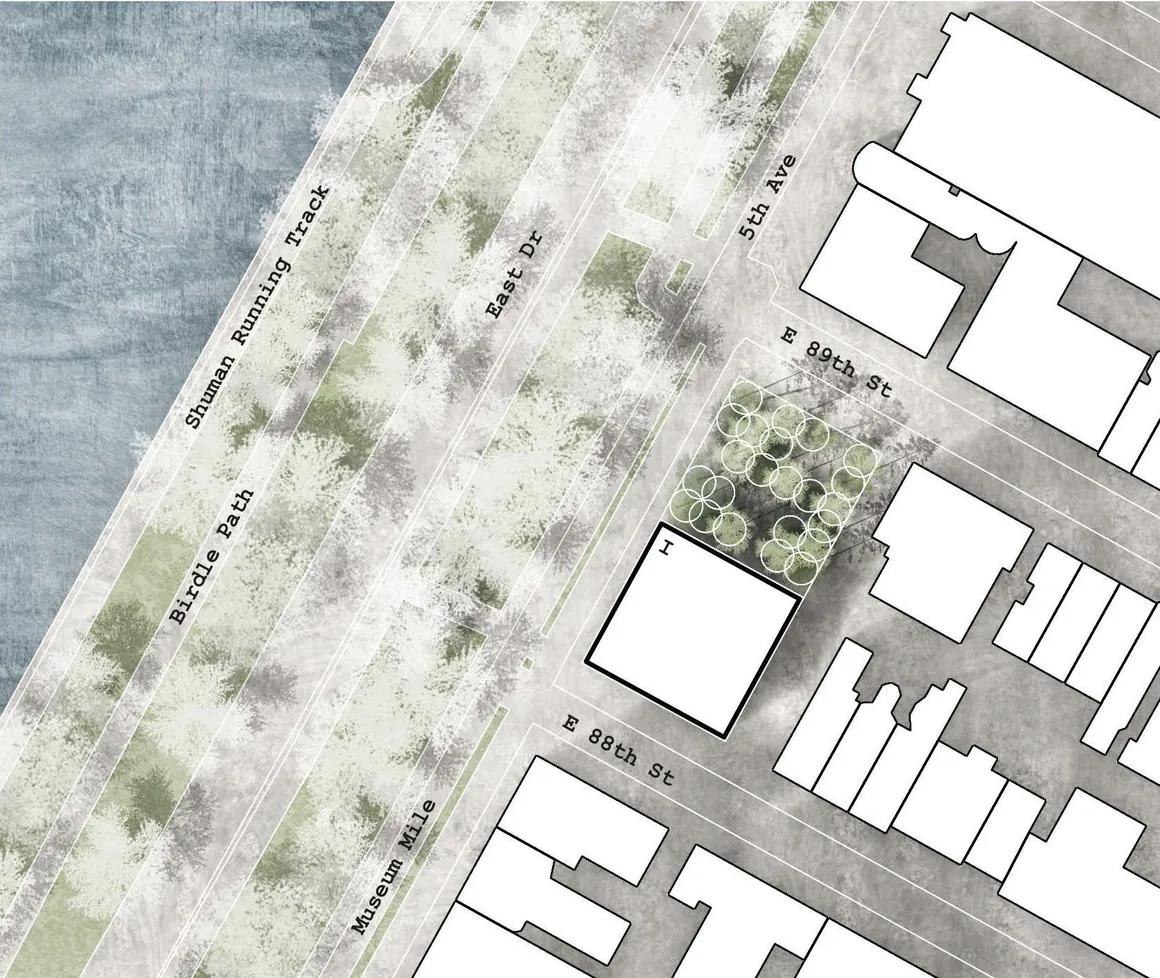
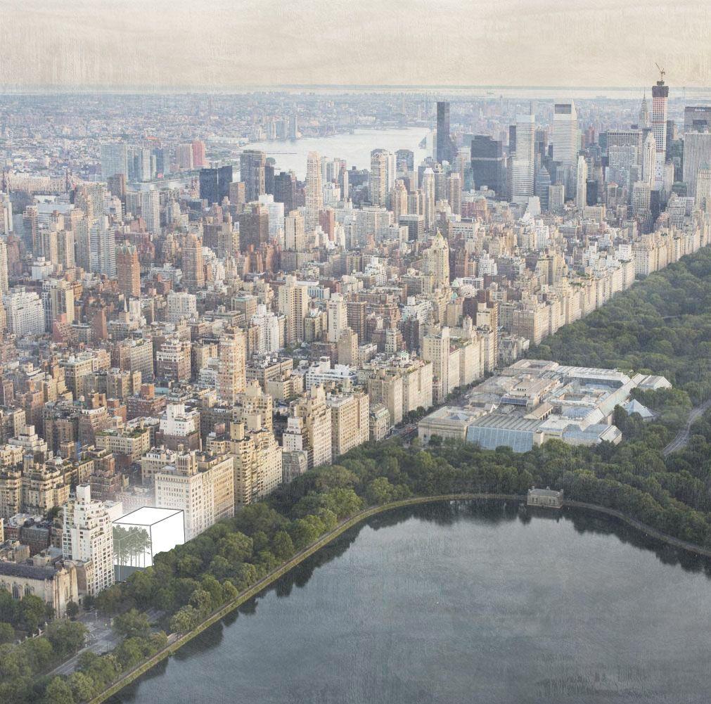
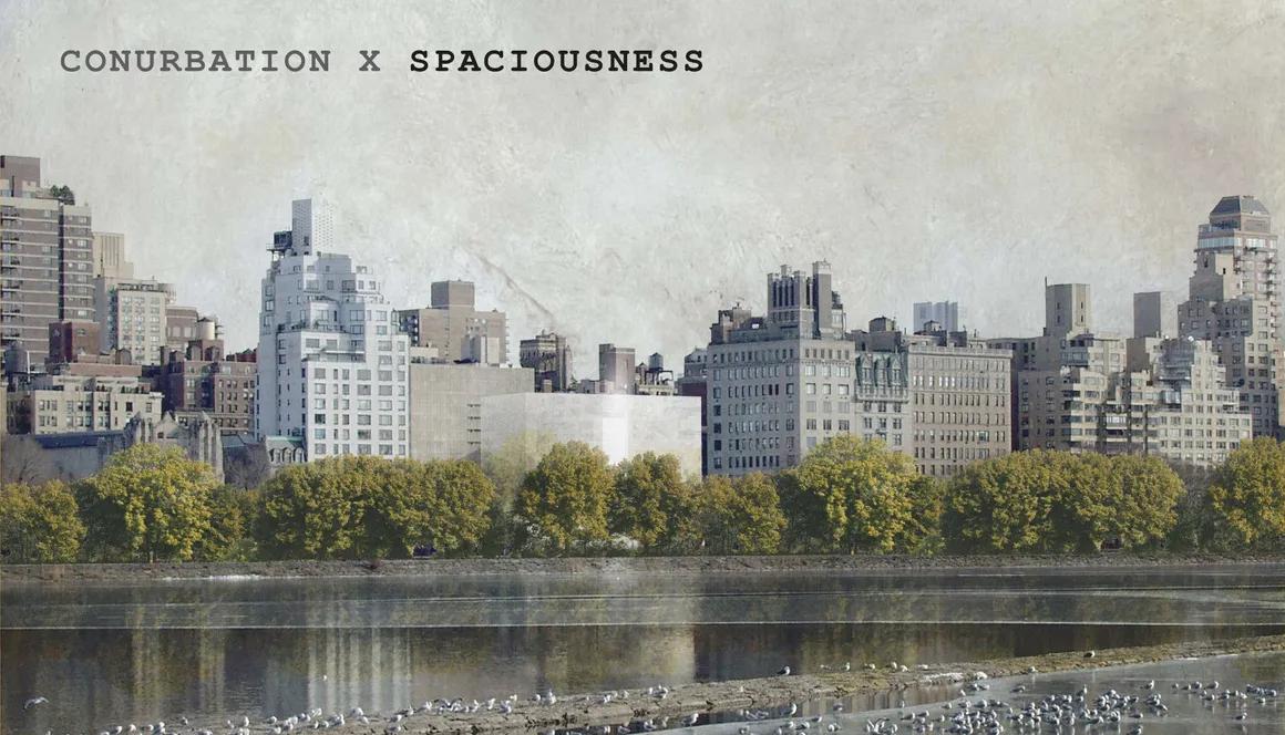
The main idea of the design is based upon two cubes (30 x 30 x 30 meters). One symbolizes the city itself while the other one stands for the free space and creates the entrance of the museum. Both cubes together form an ensemble, just like Manhatten does with the Central Park. The design itself stands out due to its smooth crossing from the city right into the park. The shape of a cube was chosen because a square with it´s identical long sides symbolizes equality and solidarity according to Frank Llyod Wrights thoughts.
Due to the square`s front, that consists of mirrors that reflect the main characteristics of the city as well as of the Central Park, the design blends in perfectly smooth into the environment. In contrast to the outside, the inside of the cube is being kept simple and clean. Thus the design does not distract from the art that is on exhibition.
Moreover the design higlights the contrast of FLW´s initial idea of Broadacre City, an urban development concept, and the situation in Manhattan today.
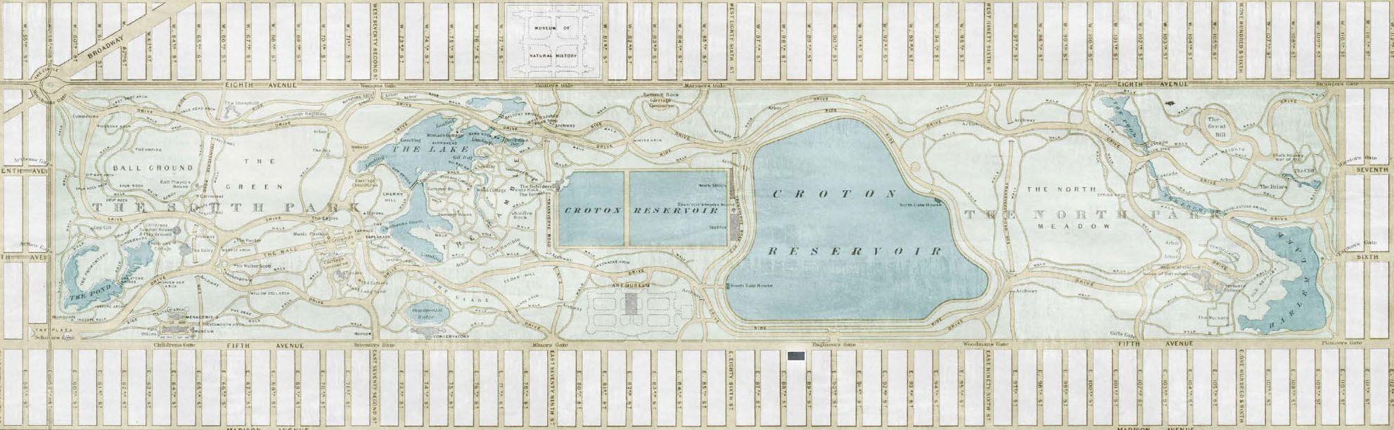
The idea of Broadacre was that each U.S. family would be given a one acre plot of land - which apparently turned out differently. The Central Park, which ist he most frequently used green area of Manhatten, both by citizens as well as by tourists, is only about ten times as big as the property each family should have according to FLW´s vision. Today about 3.5 million people visit the Central Park each month .